Choosing the right paint tones blends perception, physics, and a sense of place. In Greensboro, NC, where seasonal light and architectural styles shape interiors, color choices can brighten compact spaces, warm wide rooms, or create a calm backdrop for furnishings. The following sections explore practical steps and sensory principles for selecting paint tones for each room, with actionable tips that reflect local light and lifestyle.
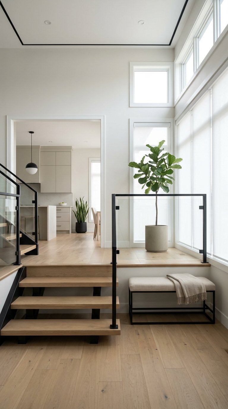
Lighting And How It Changes Color PerceptionLight alters how paint reads on walls. Natural light from north-facing windows in Greensboro tends to be steady and soft, which can mute cool pigments. South-facing rooms receive stronger daylight that can make saturated colors feel lively. East-facing rooms benefit from warm morning light, which brings out yellow and red undertones. West-facing rooms catch late light that can make cooler tones appear warmer. Artificial light also matters. Warm incandescent or warm LED bulbs deepen warm paints and soften cool ones. Cool LED bulbs emphasize blue and green notes. Test paint samples on large swatches and observe them at different times of day to see how local light shifts hue and value.
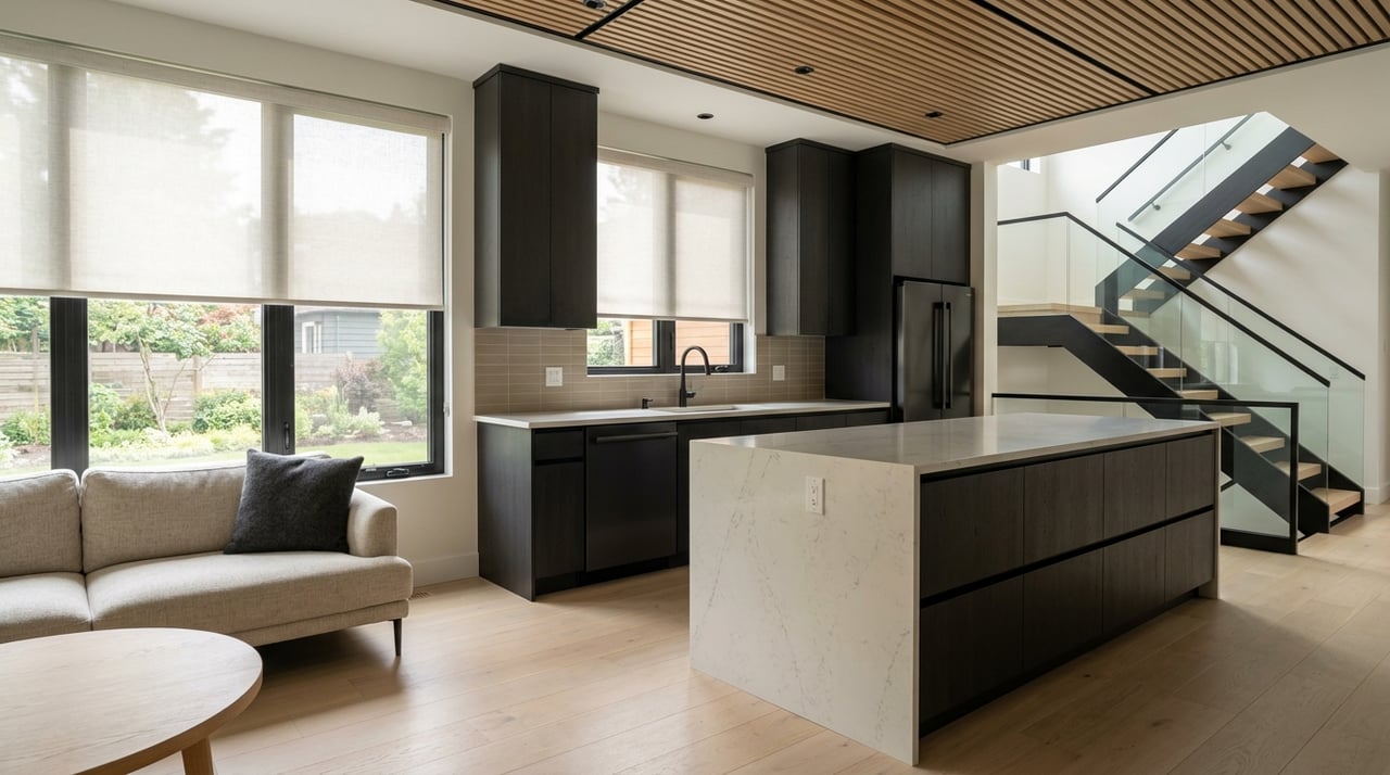
Understanding Undertones And How To Detect ThemUndertones are subtle color casts beneath the main shade. A gray can lean green, blue, or purple. A white can carry pink, yellow, or gray undertones. To detect undertones, paint a card and view it beside a true neutral like pure white or a neutral gray. Compare the edges. If the sample reads warmer beside neutrals, the undertone is warm. If the sample reads cooler, the undertone is cool. In Greensboro homes with classic trim and molding, matching undertones between wall paint and trim paint prevents visual tension. When selecting complementary tones for kitchens or living rooms, choose samples that harmonize with existing cabinetry, flooring, or brick.
Choosing Palettes For Different RoomsEach room has a functional mood that color can support. Bedrooms benefit from muted, calming tones that promote rest. Living rooms can host both conversation and relaxation, so mid-range neutrals with a single accent wall or accent furnishings work well. Kitchens often handle traffic and activity; durable paints in warm or cool neutrals hide wear and pair with metal finishes. Bathrooms can tolerate bolder tones because tile and fixtures add texture. Home offices need colors that aid focus; mid-tones with subtle warmth can reduce eye strain. Hallways and stairwells often lack natural light, so lighter tones prevent a closed feeling. Consider flow between adjacent rooms so hues transition smoothly.
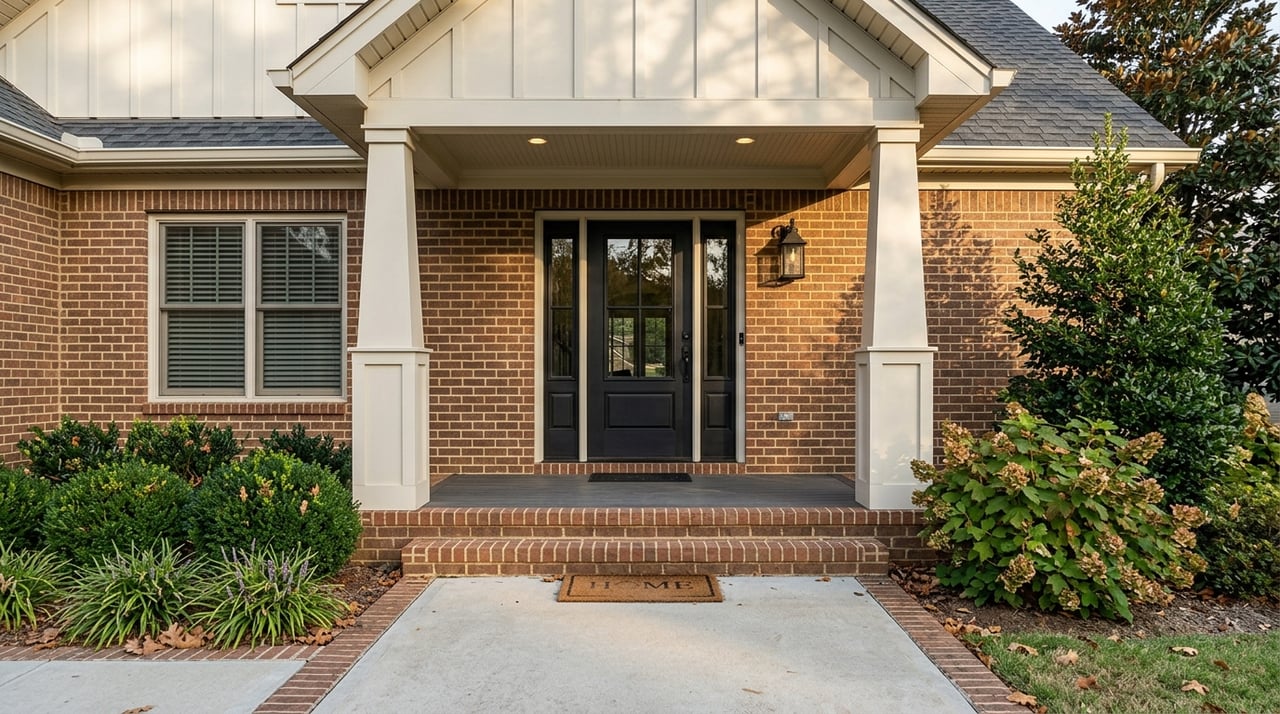
Selecting Finishes For Practicality And EffectPaint sheen affects appearance and maintenance. Flat finishes hide wall imperfections and offer a soft look that suits low-traffic rooms. Eggshell or satin sheens reflect more light and clean more easily, which makes them suitable for living spaces and dining areas. Semi-gloss or gloss are resilient and wipeable, ideal for trim, doors, and kitchens. Match the finish to the room’s use and to architectural details. In historic Greensboro homes with molded trim, a higher sheen on trim enhances profile and provides contrast with flat walls. Test small areas to ensure the sheen complements the chosen tone.
Testing Samples In PlaceSwatches on paint cards rarely predict final results. Paint large sample patches directly on walls or on poster board that can move between rooms. Observe samples at midday, evening, and under artificial light to note shifts. Allow paint to dry fully before judging, because wet paint can look darker. For open floor plans, place samples where they will be seen from multiple angles so the interaction with adjacent colors becomes clear. In rooms with strong sunlight, test smaller areas near shadows as well to gauge subtle transitions.
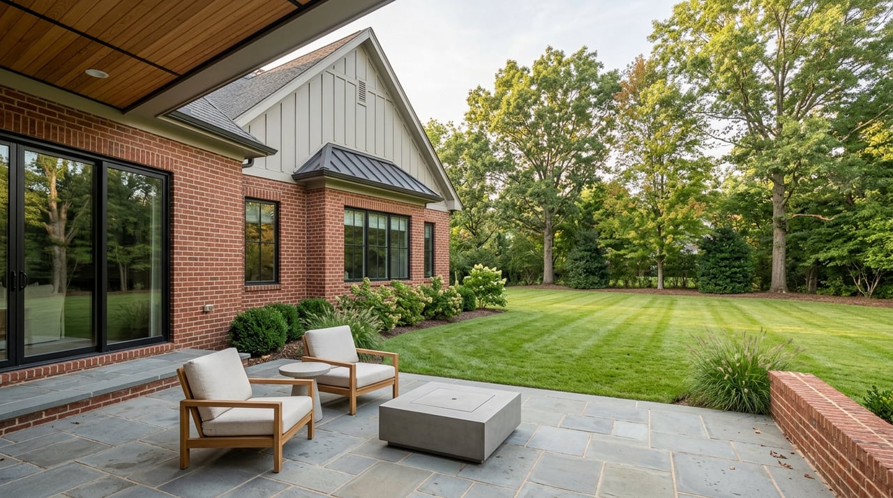
Working With Existing Flooring And FinishesFlooring and built elements anchor room palettes. Hardwood floors in warm tones pair naturally with cool wall tones for contrast. Cooler floors often match warmer walls for balance. When choosing paint, bring a flooring sample or photograph to the paint store or use digital tools that capture color families. For rooms with built-in cabinetry or visible brickwork, select wall tones that complement rather than compete. In mid-century or traditional Greensboro homes, original wood tones and plaster finishes benefit from neutral walls that highlight the architectural detail.
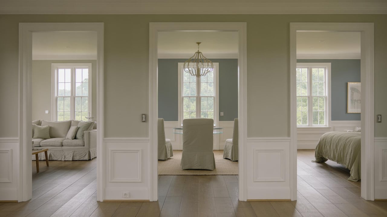
Creating Harmony Across Connected SpacesColor flow matters in open-plan layouts or rooms connected by sightlines. Use a unifying element such as a shared neutral or a repeated accent tone to maintain cohesion. Transition spaces like foyers and landings set the stage for neighboring rooms; choose a tone that bridges styles. For example, a warm neutral can ease the move from a blue living room to a green dining area. Keep ceiling and trim colors consistent throughout to create continuity. Small shifts in value between rooms create visual interest while maintaining overall harmony.
Using Color To Influence Perception Of SpaceColor can change how a room feels. Light tones expand a room and reflect more light, which helps smaller spaces feel open. Dark tones make large rooms feel more intimate by absorbing light and grounding furnishings. Cool colors tend to recede and can make a wall seem farther away, which suits narrow rooms. Warm colors advance visually and can make vaulted spaces feel cozier. Apply darker tones to accent walls or architectural features to create depth. In rooms with high ceilings, a darker ceiling color can reduce the sense of height and foster a more enclosed, welcoming atmosphere.
Working With Local Buyer Preferences And Market AppealBuyer preferences in Greensboro influence paint choices when preparing a property for sale. Neutral palettes that read warm tend to appeal to a broad range of preferences while allowing fixtures and furnishings to stand out. Maintain consistent trim colors and repair visible scuffs before showing a home. Neutral walls paired with updated finishes and good lighting can enhance perceived value. Consult a local real estate agent for insight on current color trends that resonate with area buyers and align paint choices with neighborhood styles.
Selecting Color Tools And ResourcesProfessional color tools help refine choices. Large format color cards and peel-and-stick samples show actual paint behavior. Digital room visualizers provide quick mockups but should be verified with physical samples. Many paint manufacturers offer consultation services or in-store staff who can recommend compatible palettes. When working with a color professional or contractor, bring photos of furniture, textiles, and flooring to ensure cohesive selections. In Greensboro, local paint retailers may offer region-specific recommendations that account for seasonal light and common architectural materials.
Ready to Paint with Purpose
Understanding the science behind color lets you tailor mood, light, and perception room by room for a home that truly feels intentional. Whether you're refreshing a single space or reimagining your whole house — in null or anywhere else — thoughtful tones make a measurable difference. For guidance that blends design insight with real estate expertise, consult the theKathy Haines team. Reach out to theKathy Haines today to start selecting the perfect palette for your home.